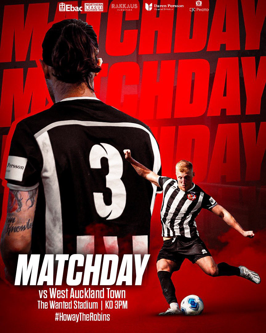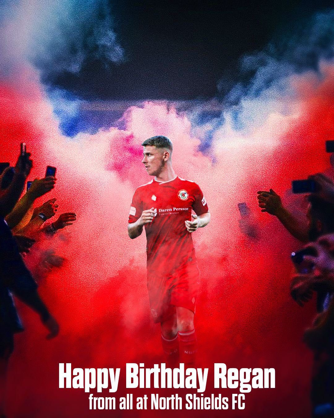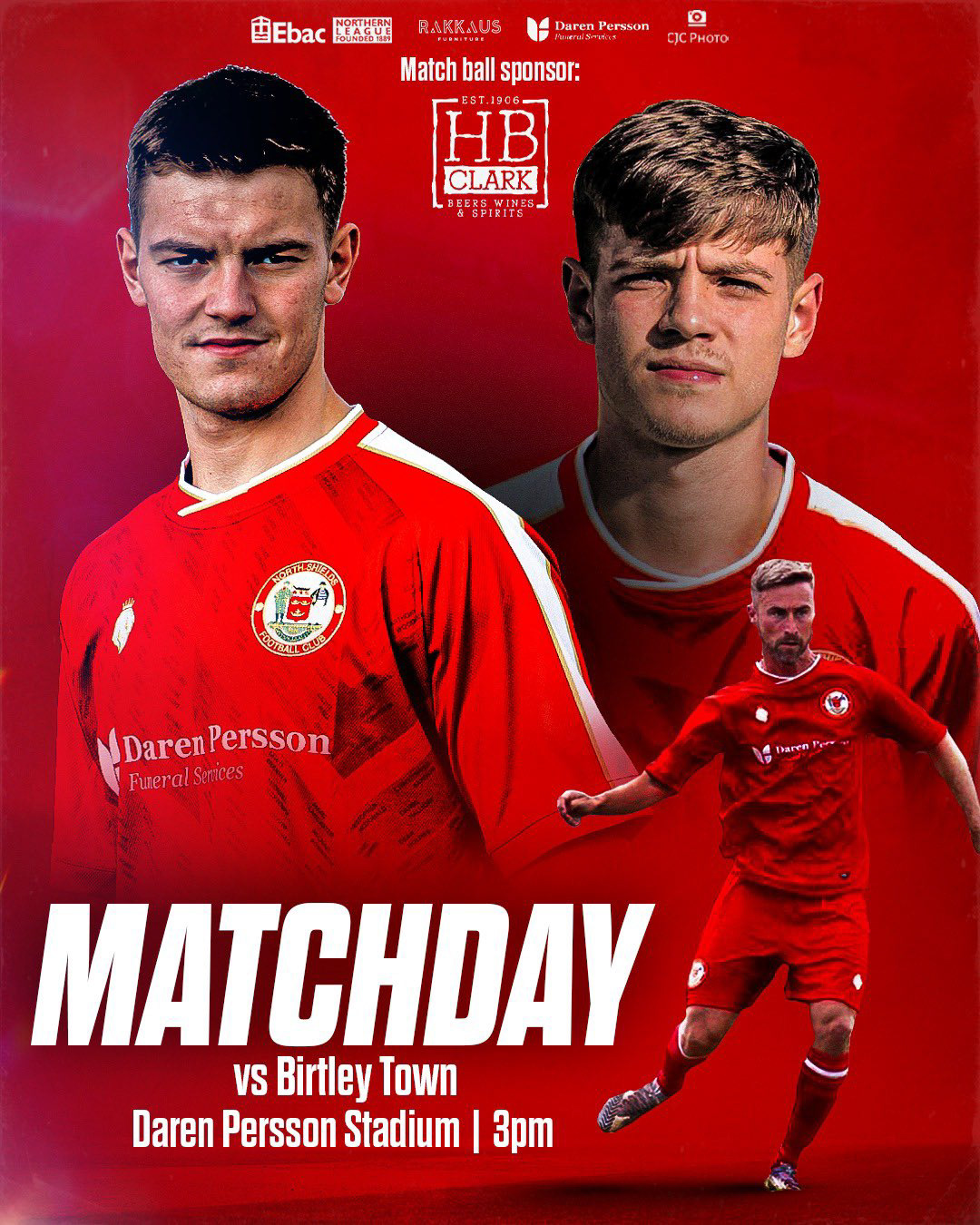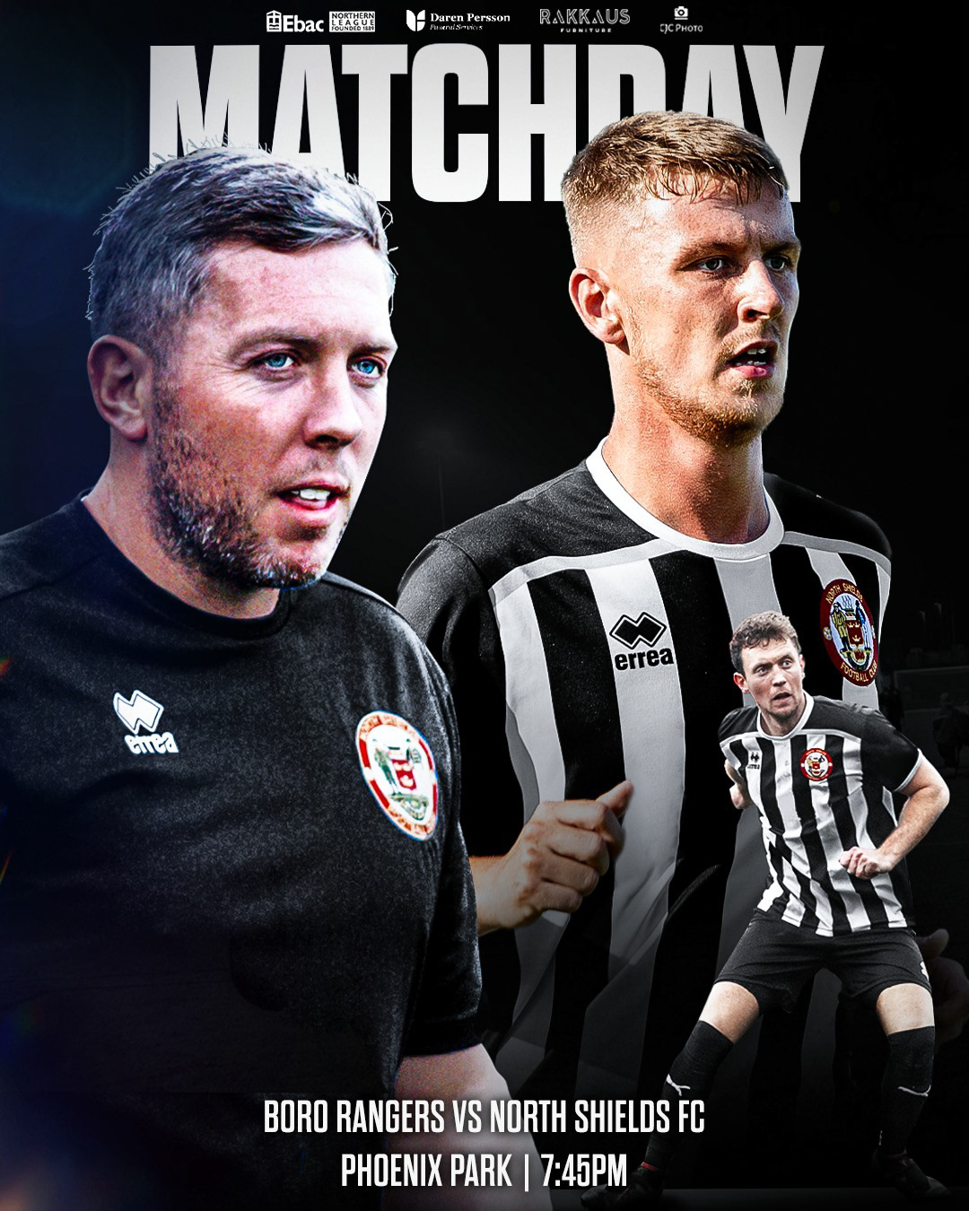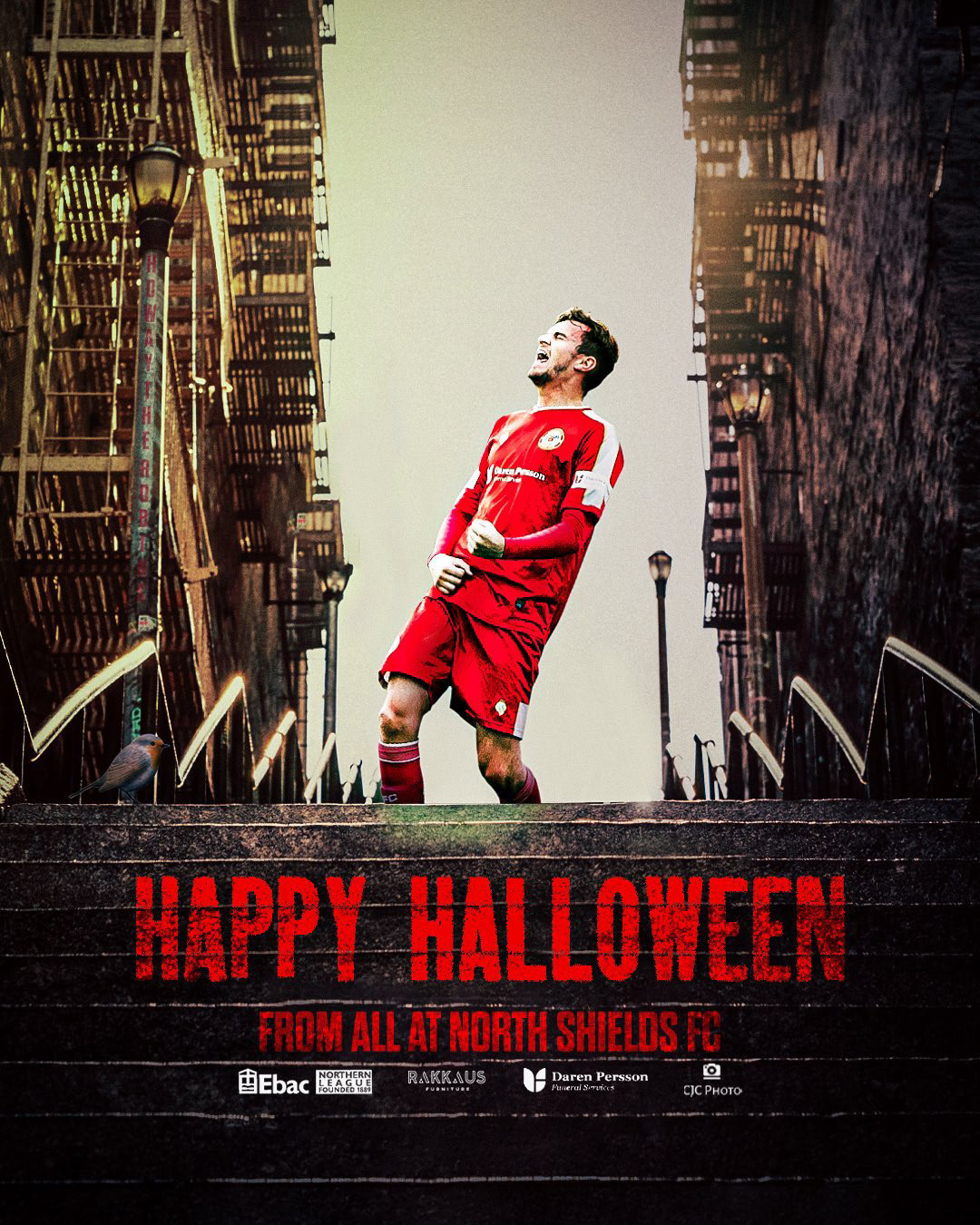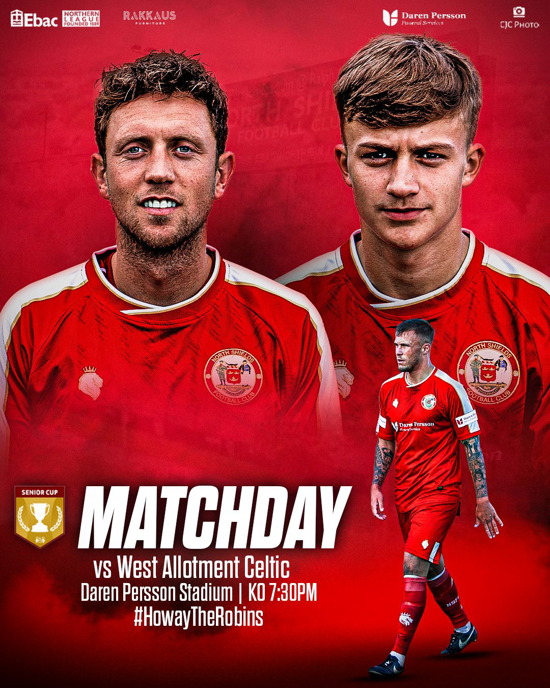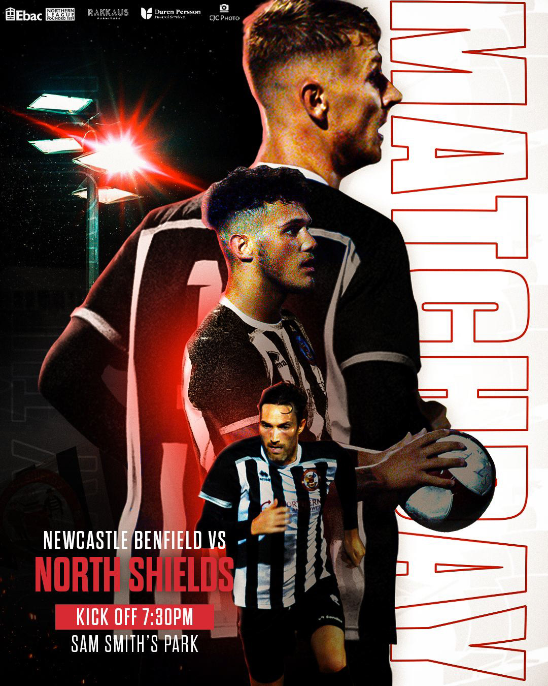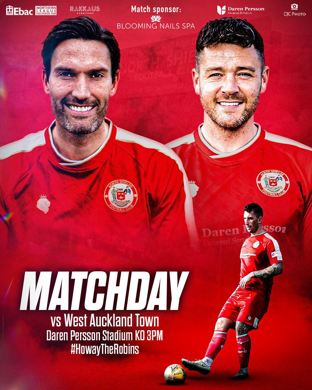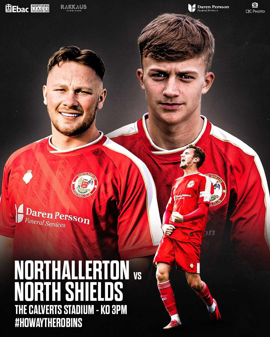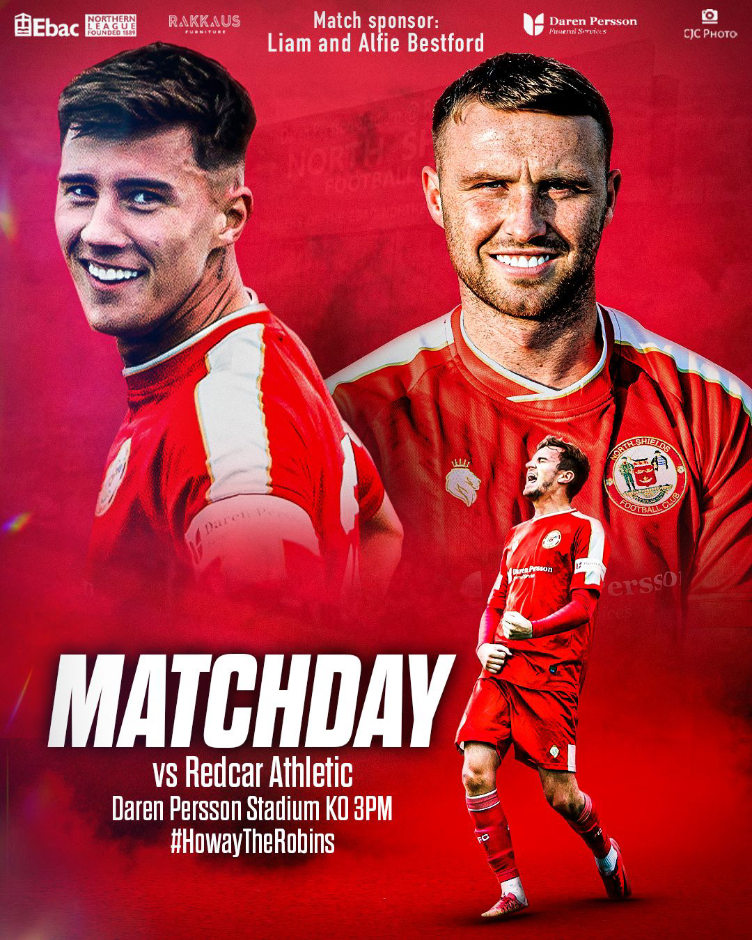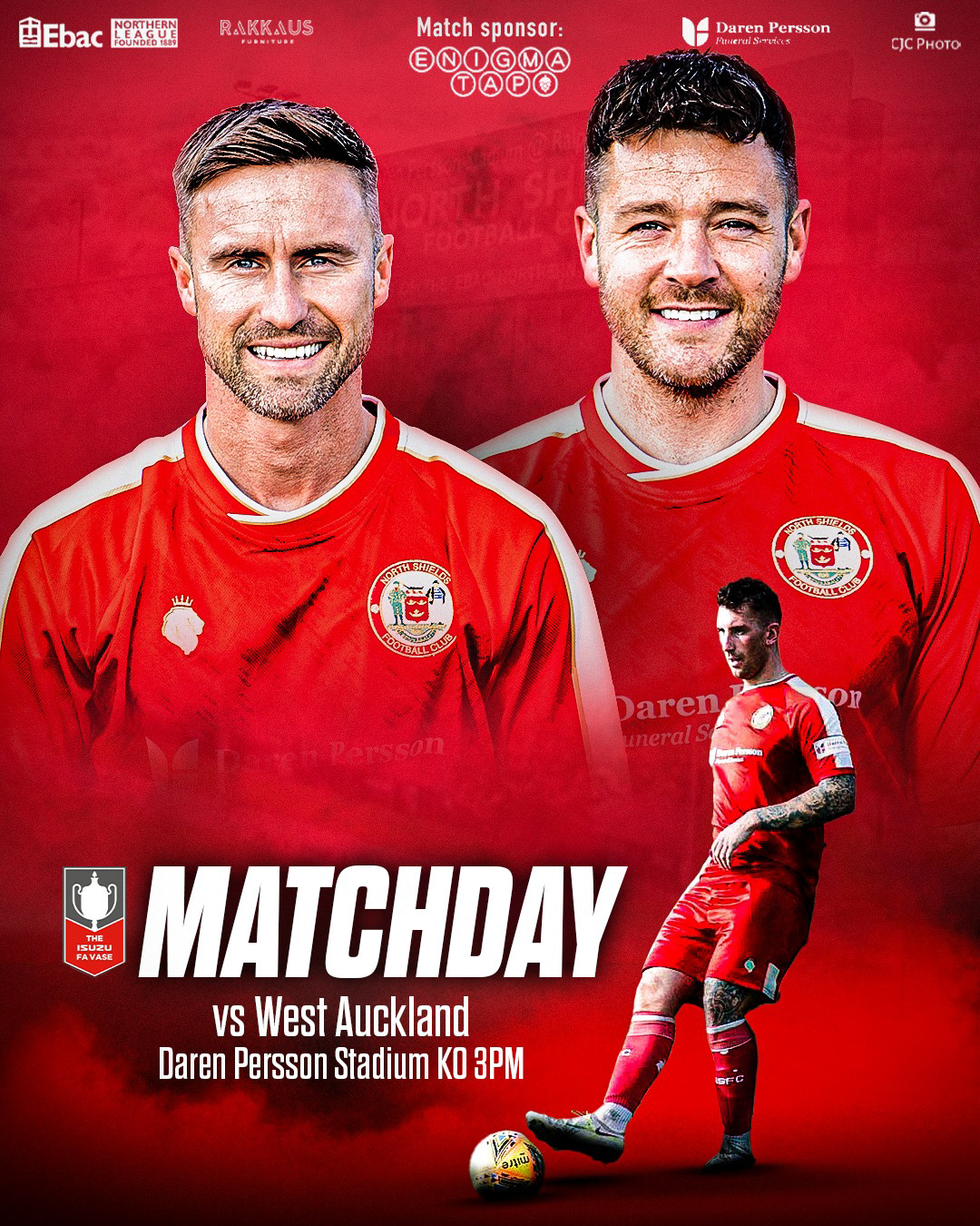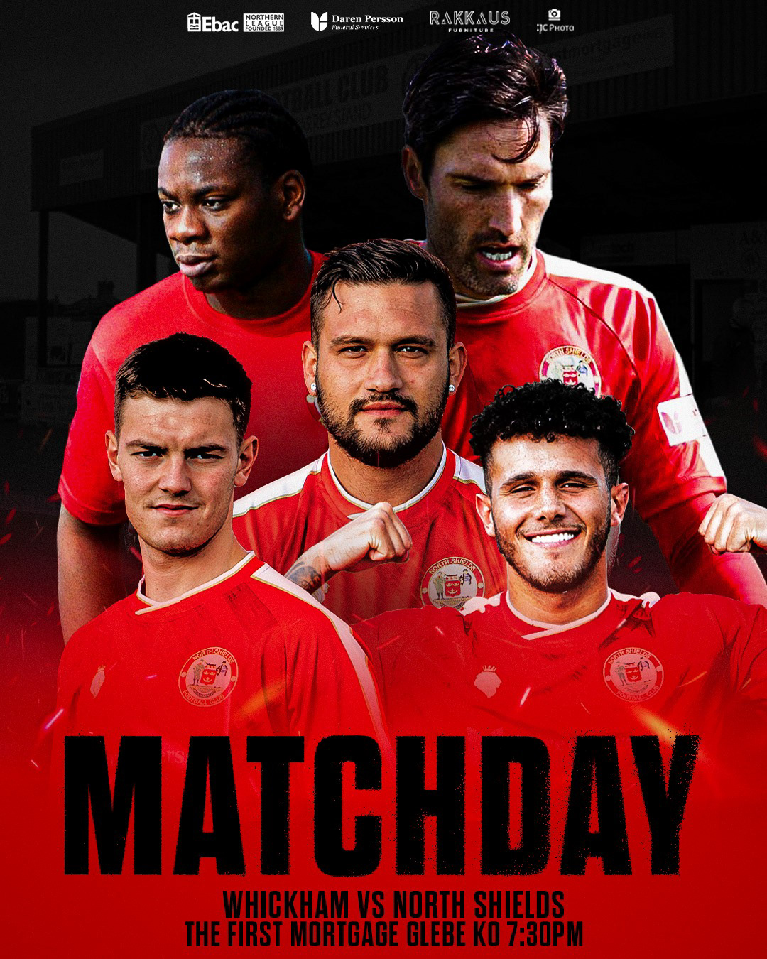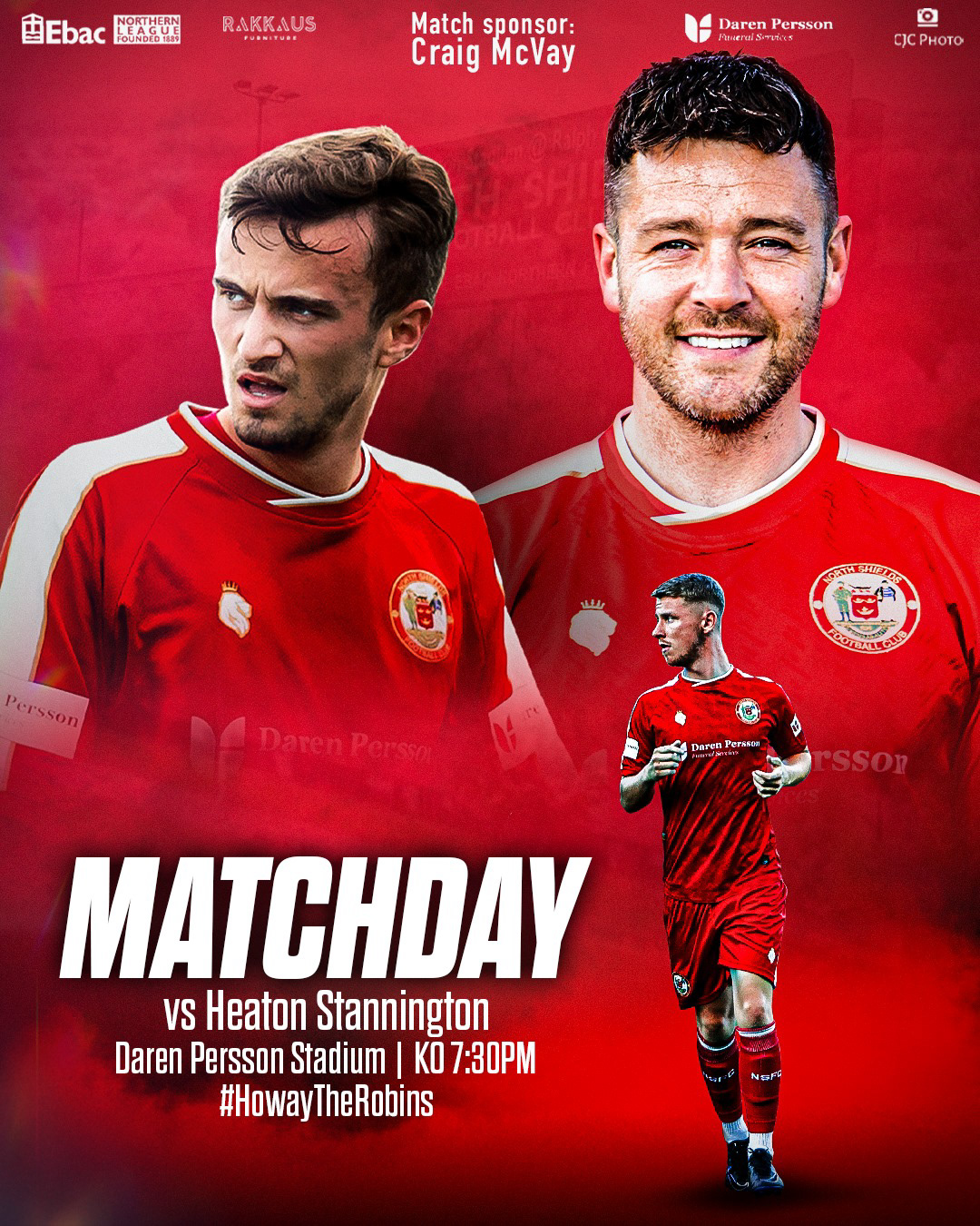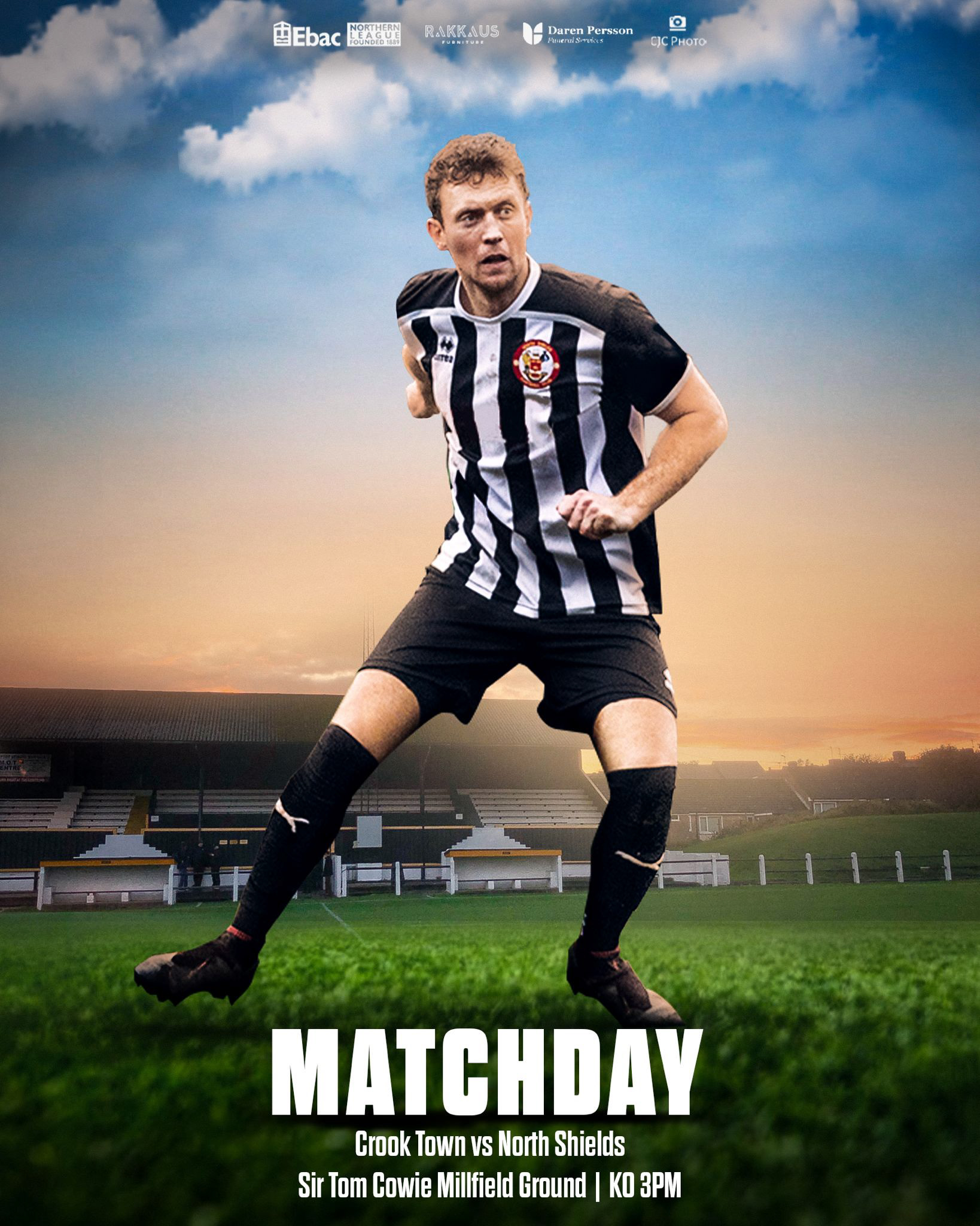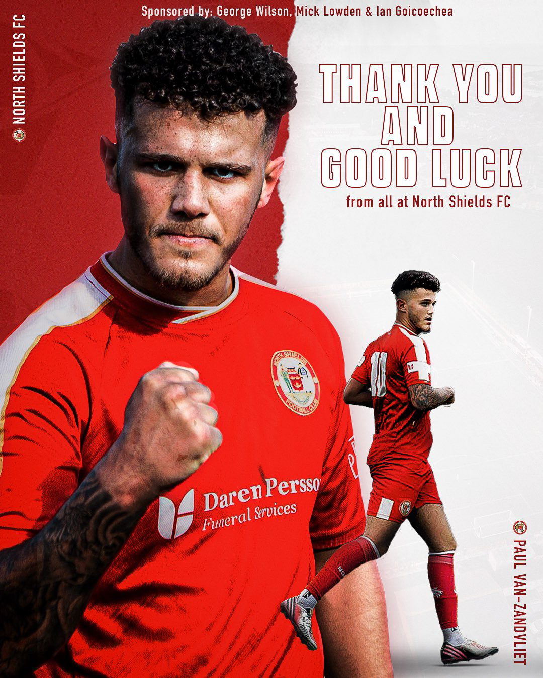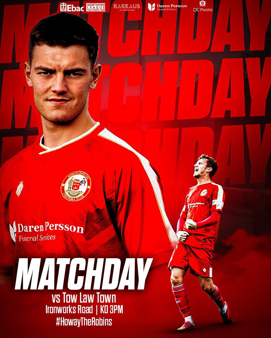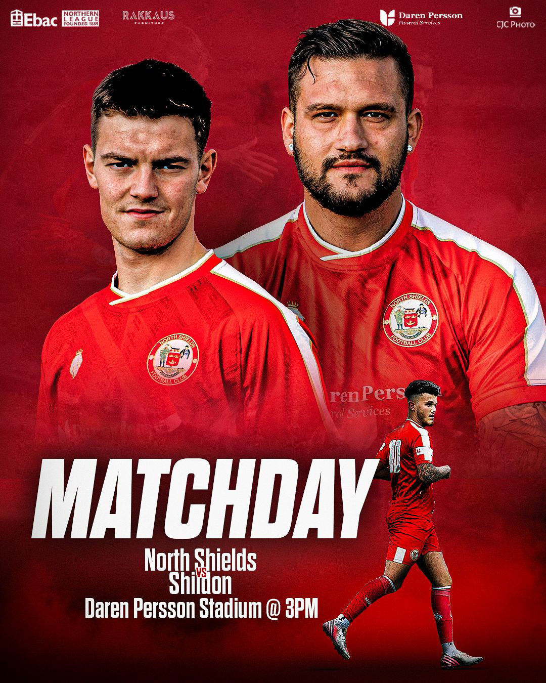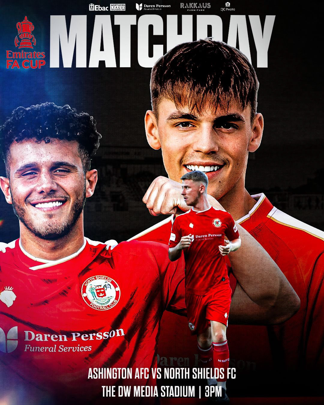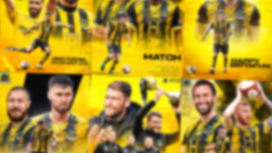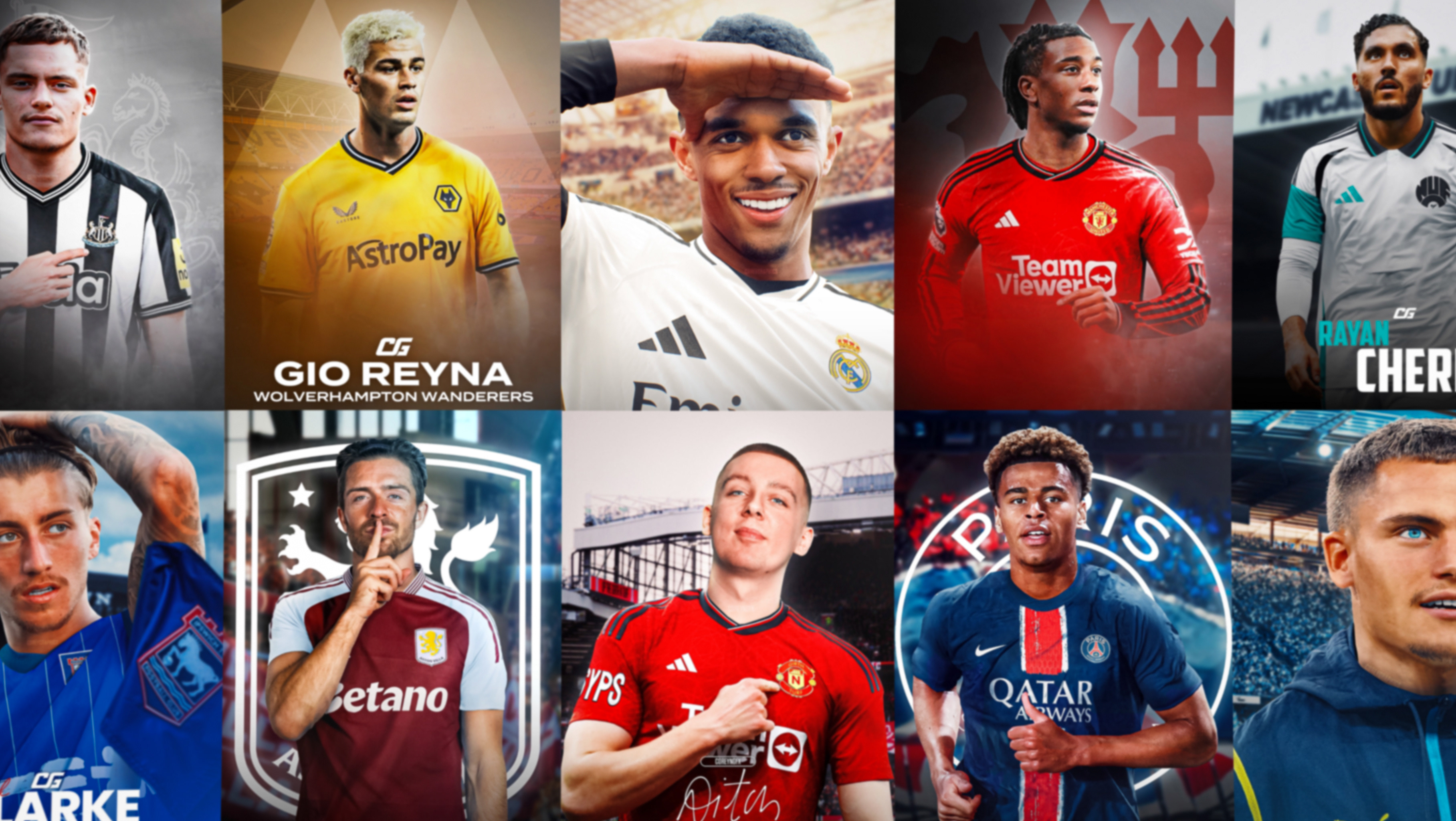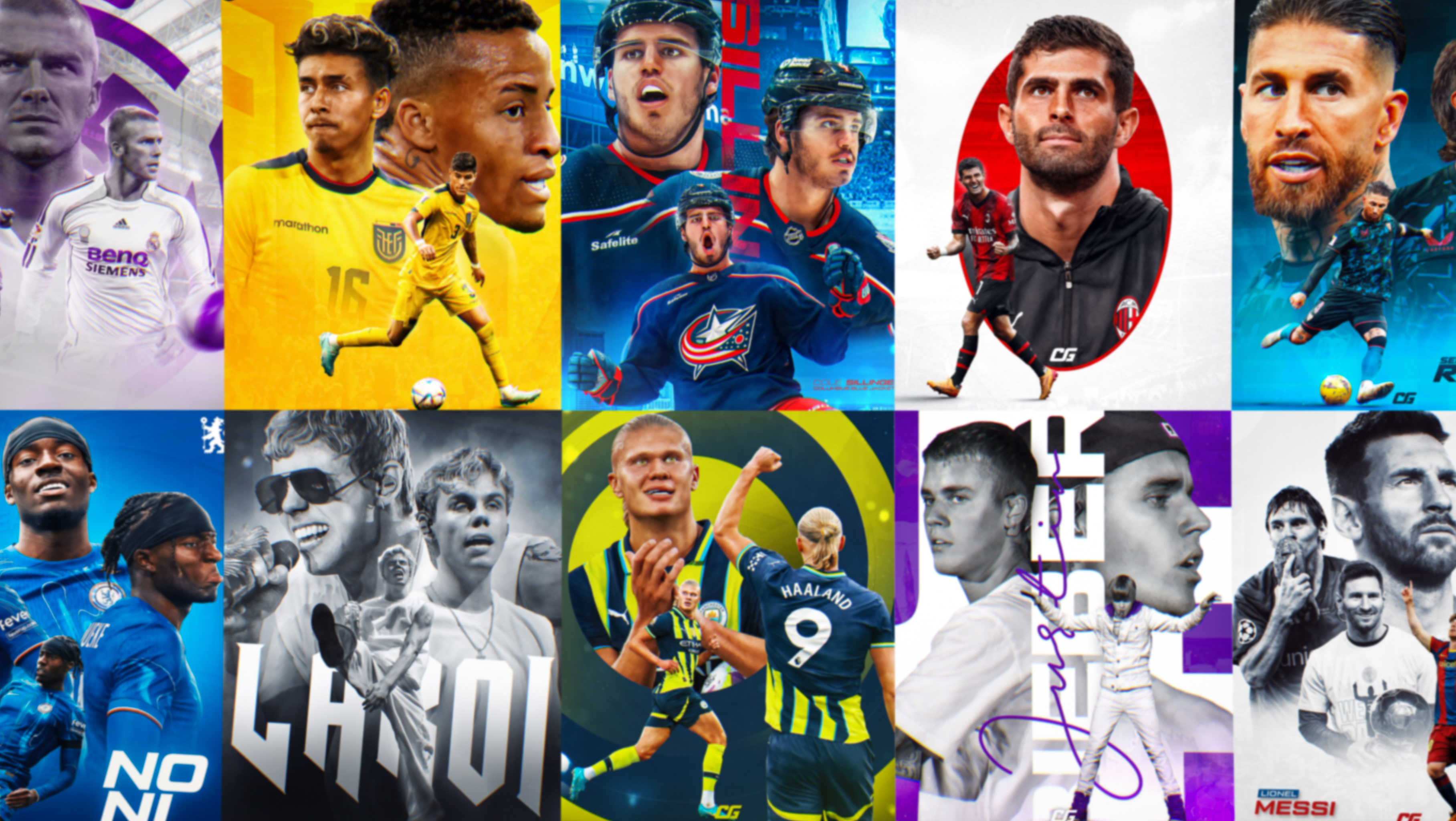

As the in-house graphic designer at North Shields Football Club, I set out to modernise the media output and maintain a strong visual identity that was consistent with the already established ‘Robins’ brand image, including colours, assets and typography.
#HowayTheRobins

North Shields FC is a leading semi-professional team in the EBAC Northern League. Recent achievements include record league positions and winning the FA Vase in 2015. The fan base has grown significantly in the past few years, with social media reaching over 300k on average and a dedicated following of upwards of 14k. As the club's graphic designer, my job was to connect with fans and ensure high-quality designs across our platforms.

While brainstorming the social content for North Shields FC, I wanted to include some assets that would link the club, the area, and the history. Due to this, I included a central visual element in my designs: the ship taken directly from the club badge. The iconic symbol not only acts as a visually appealing element that unifies designs but also acknowledges the history of North Shields as a fishing village. Consequently, North Shields’ social output can be recognised even at a glance as the ship symbol became synonymous with the brand.
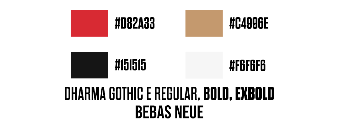
Additionally, the badge helped guide colours and typography. The iconic red and gold associated with North Shields were taken directly from the badge to make designs, and the fonts selected were Dharma Gothic E, and Bebas Neue.

The templates are altered to match our kit colours depending on whether the team played home or away.
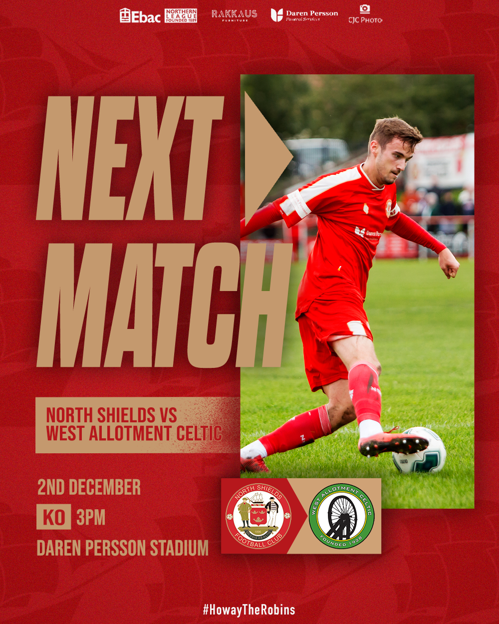
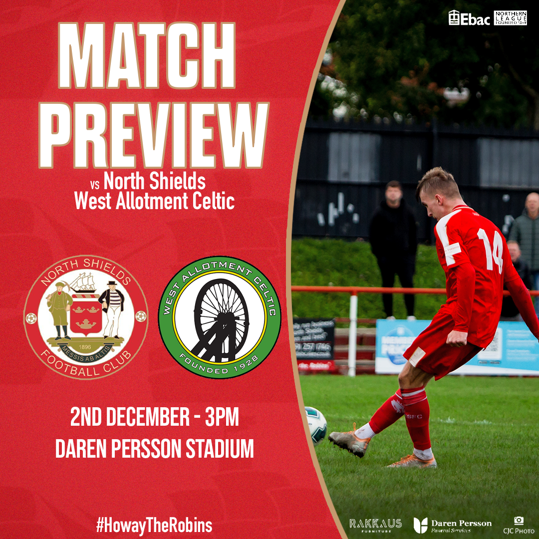
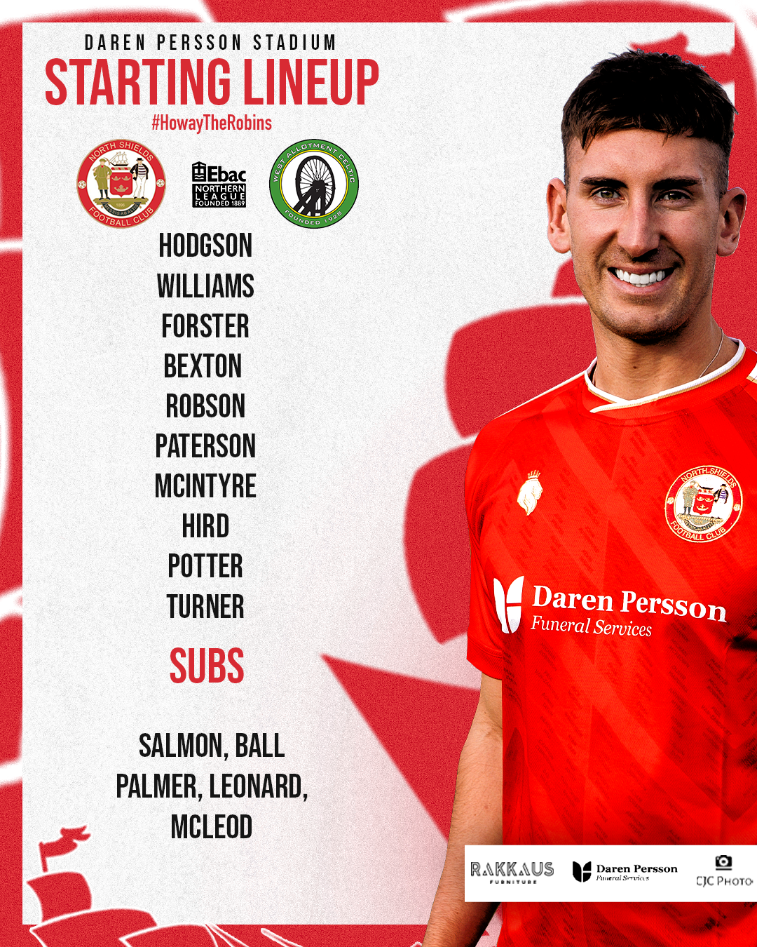
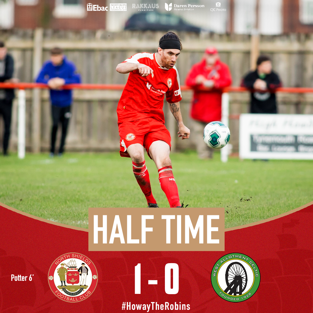
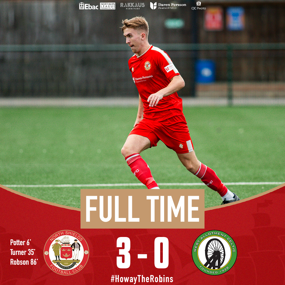
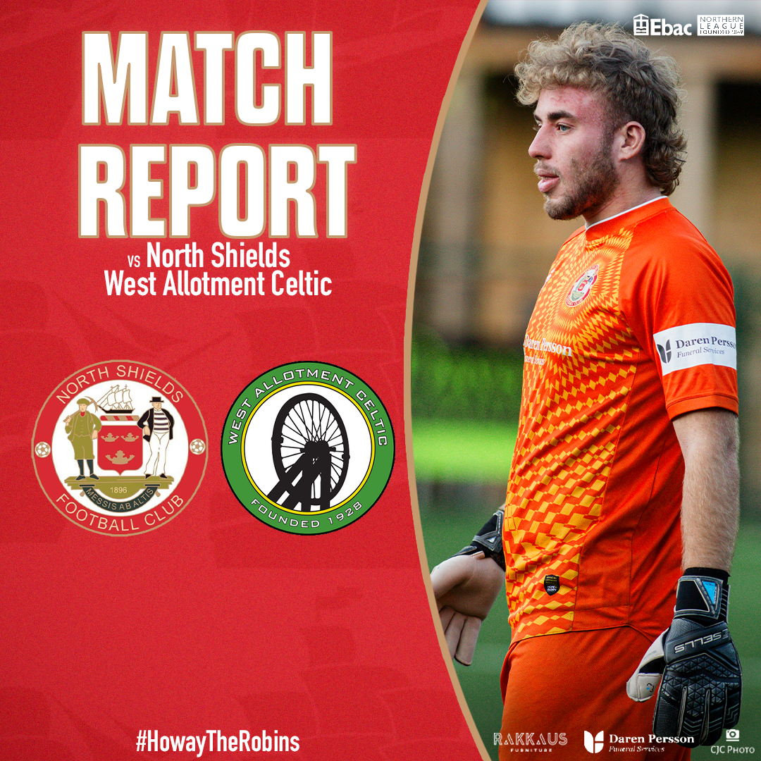
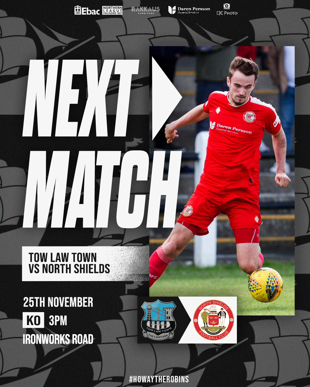
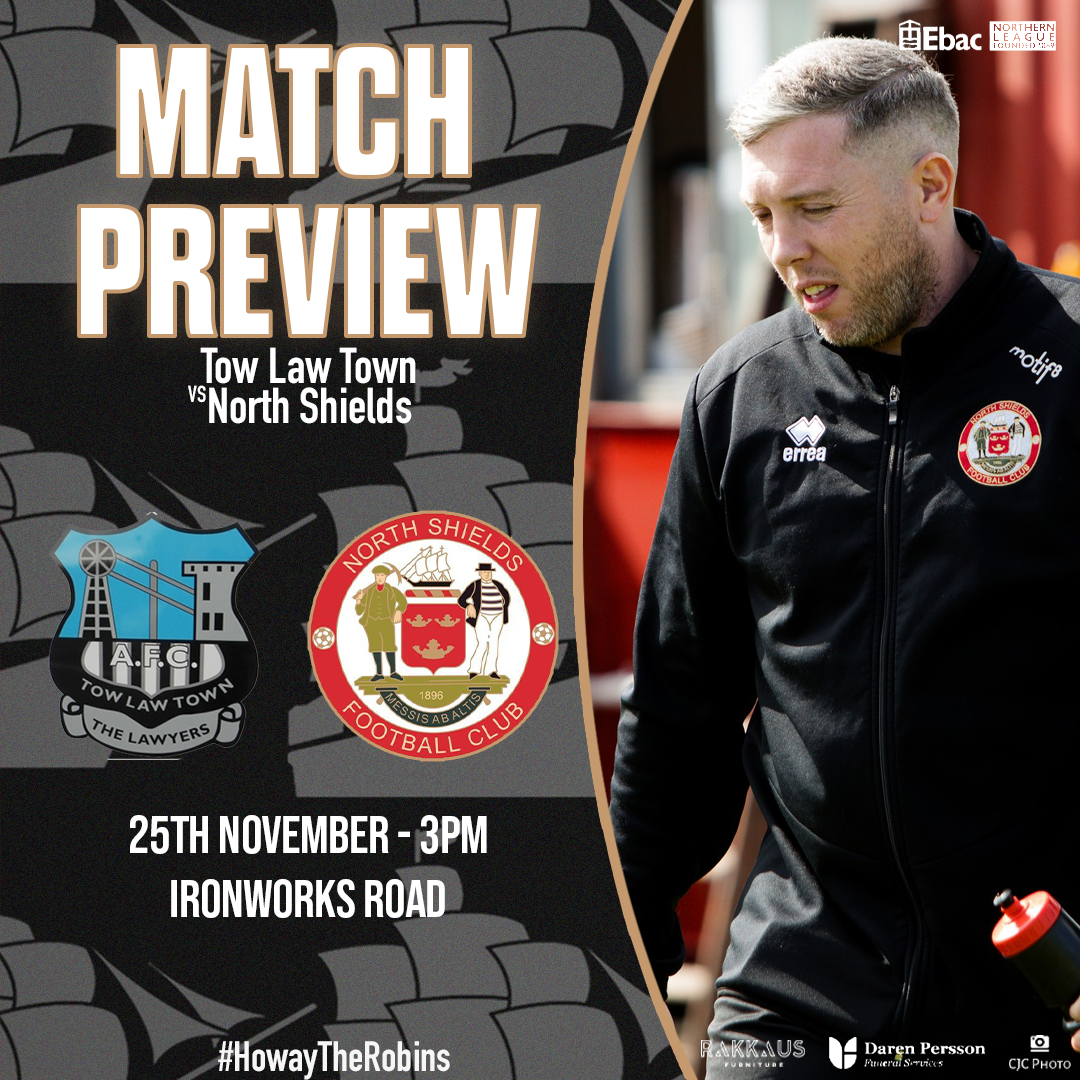
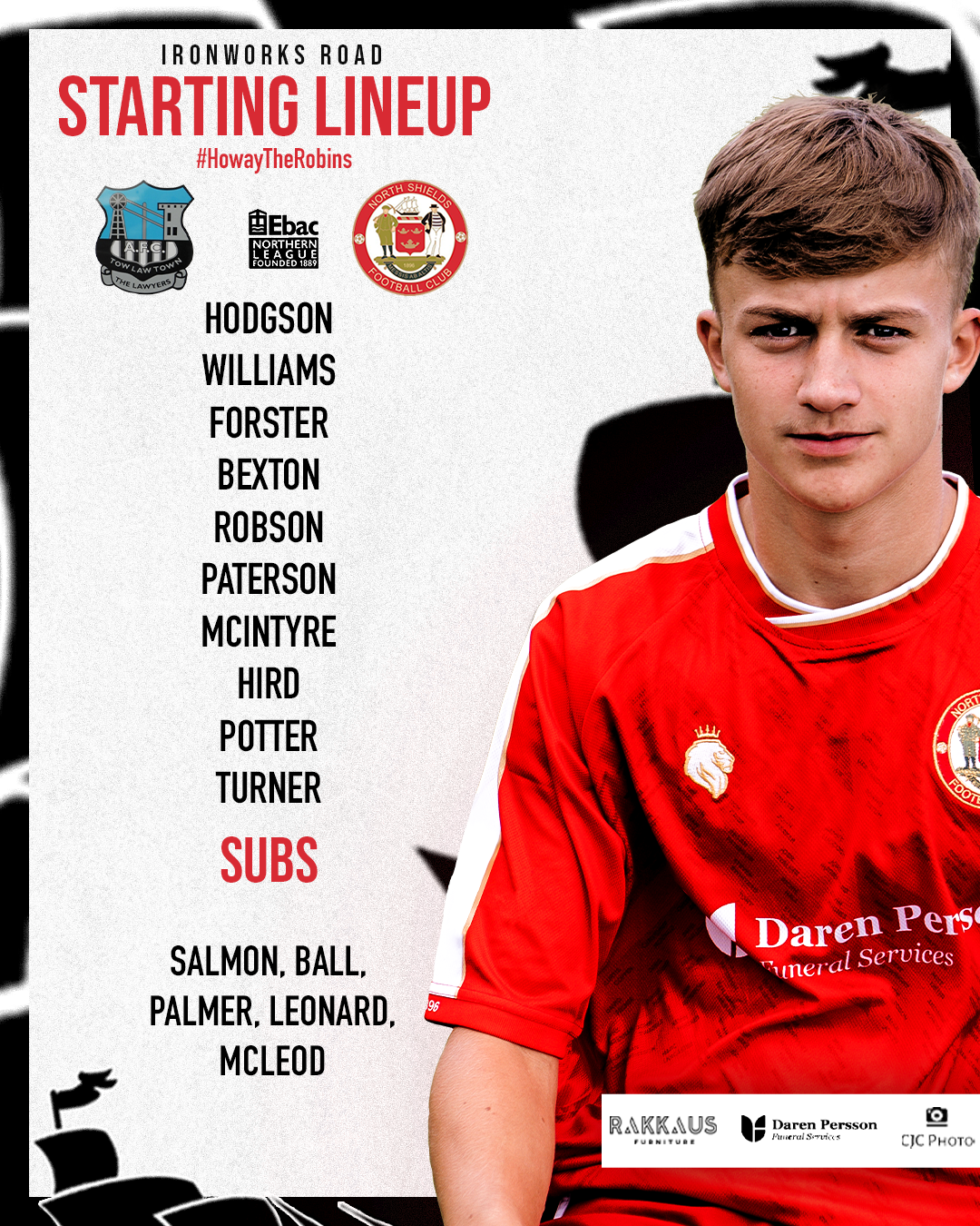
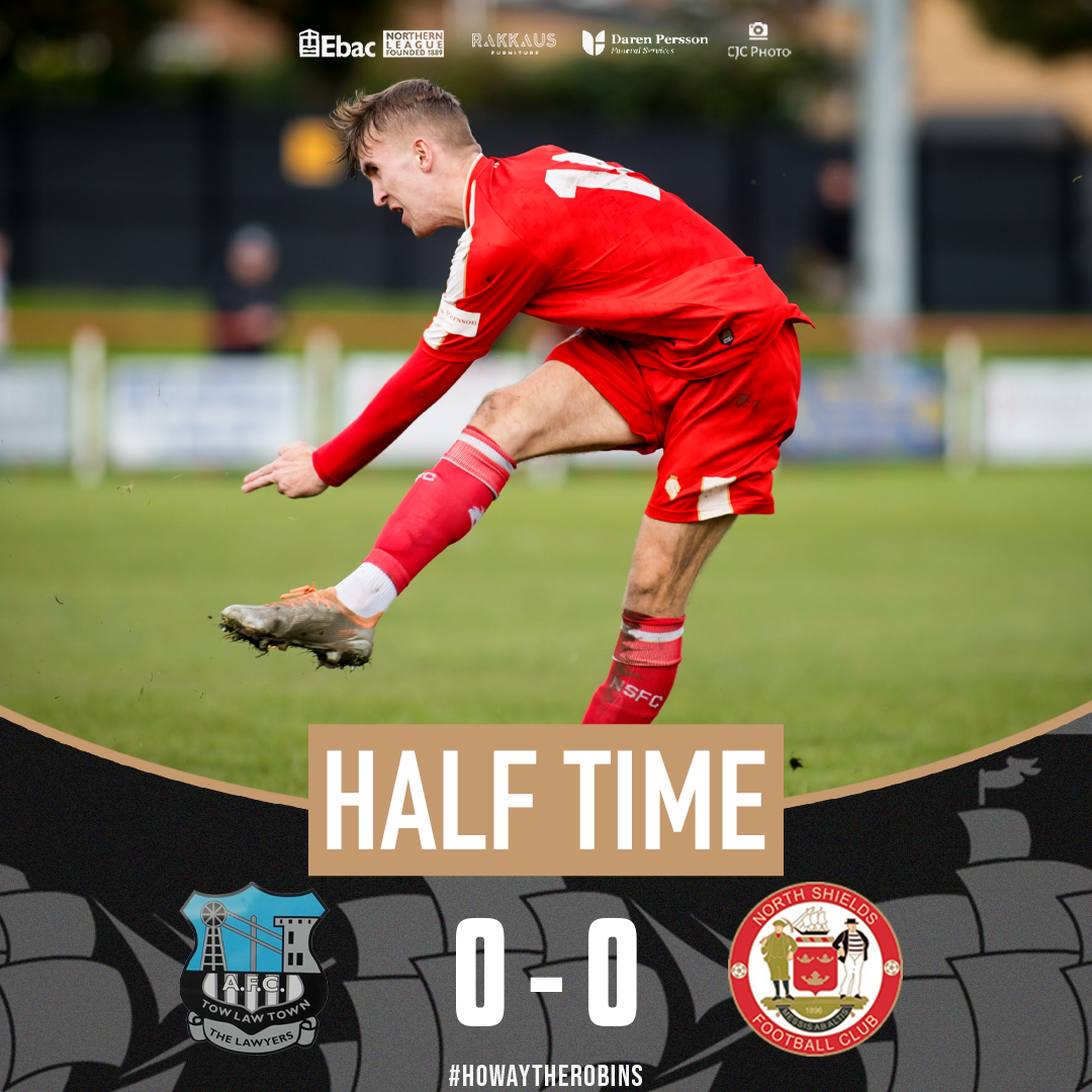
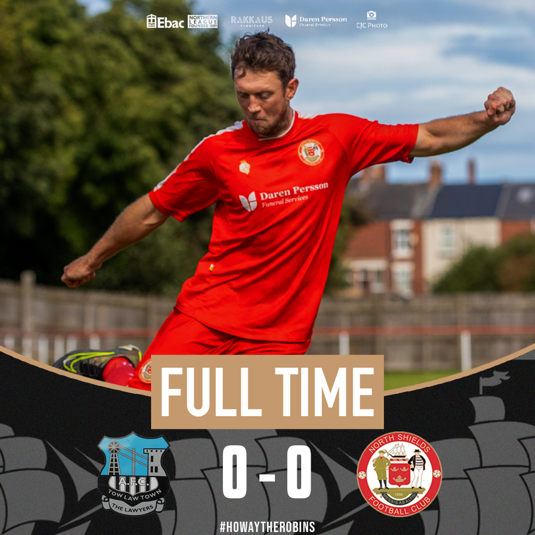
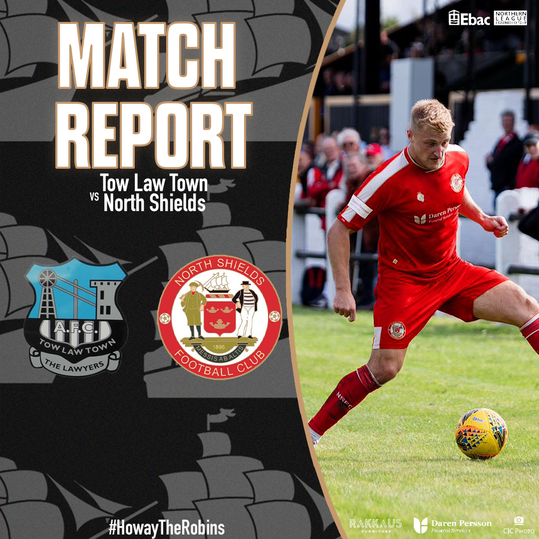

A mixture of matchday graphics and more!